Client
Atomic (concept)
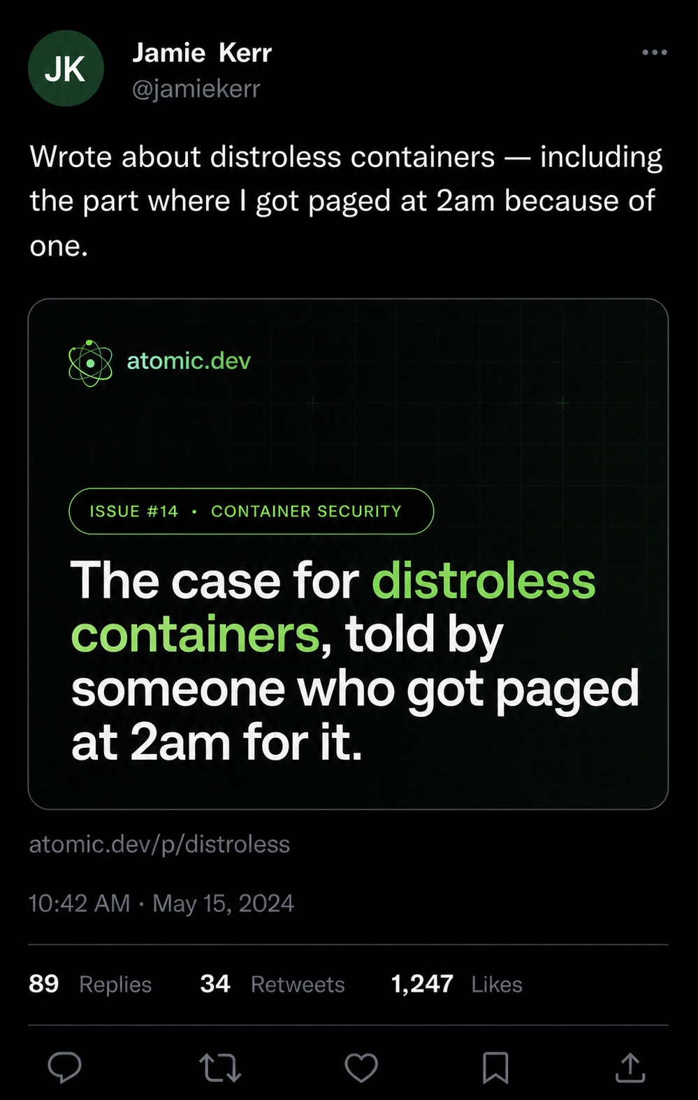
Atomic is a fictional brand: a newsletter platform built for technical writers — engineers, security researchers, devtool founders — who want their long-form to look like their docs. Most newsletter platforms ship one OG template that doesn't fit different page types. We built three: homepage, blog post, pricing — same brand, different jobs.
Atomic's audience writes for technical readers who scroll past 99% of social cards because they all look the same — a centered headline, a stock gradient, a logo in the bottom right. The brief was to make OG cards that look like *something a terminal would render* — IBM Plex Mono, off-black background, electric green accents, a grid that hints at a screen but doesn't fight the headline.
Three card variants because three page types. Homepage cards prove the platform exists. Blog post cards advertise the writer. Pricing cards close the deal. Same shape language, different focal point per type.
All cards rendered at exact 1200×630 platform spec. Each tested for legibility on Twitter, LinkedIn, iMessage preview, Slack unfurl.
Free for the first 100 subscribers. After that, one tier. No upsells, no per-seat tax.
An OG card spends 1.2 seconds in someone's feed before they decide whether to click. These cards survive that test on every major platform. Below: how each renders at typical preview size in three real contexts.
Renders at ~506×266. Headline hierarchy + green accent survive at thumbnail.
Author byline holds. Highlighted word reads even at 1/4 scale.
Inverted color treatment ensures pricing card still reads. Brand → product → price.